
In this article, we will introduce how to use Python’s Matplotlib, Seaborn, and Plotly Express packages to draw scatter charts and line Charts.
The complete code can be found in .
Table of Contents
Matplotlib
Matplotlib ‘s plot() can draw scatter and line charts. Its declaration is as follows. We only list the commonly used parameters here. Please refer to the official website for other parameters.
matplotlib.pyplot.plot(x, y, fmt, data)
- x: The coordinates on the x-axis. The type is array-like or column name of data.
- y: The coordinates on the y-axis. The type is array-like or column name of data.
- fmt: A string in the format of [marker][line][color]. For detailed values, please refer to the official website .
- marker: The style of the point.
- line: The style of the line.
- color: Color.
- data: Data.
In addition, Matplotlib’s scatter() can also draw scatter charts. It can set the size and color of each point.
matplotlib.pyplot.scatter(x,
                          y,
                          sizes=None,
                          c=None,
                          marker=None,
                          cmap=None,
                          alpha=None,
data=None)- x: The coordinates on the x-axis. The type is array-like or column name of data.
- y: The coordinates on the y-axis. The type is array-like or column name of data.
- data: Data.
- marker:Tthe style of the point.
- sizes: Point size. The type is float or array-like.
- c: color. The type is color or array-like.
- cmap:Color map。
- alpha: Opacity. The type is float.
Scatter Charts
The following example shows how to use plot() to draw a scatter chart.
import matplotlib.pyplot as plt
x = [1, 2, 3, 4, 5]
y = [2, 3, 4, 5, 1]
plt.plot(x, y, 'o', label='o')
plt.plot(y, x, 'x', label='x')
plt.legend()
plt.xlabel('X')
plt.ylabel('Y')
plt.title('Scatter Chart')
In the first example, we use plot() to draw (x, y), the parameter label can set the label in the legend, and call legend() to display the legend. xlabel() and ylabel() can set the title of the x-axis and y-axis. And title() sets the title of the chart.
import pandas as pd
df = pd.DataFrame([
    [1, 2],
    [2, 3],
    [3, 4],
    [4, 5],
    [5, 1],
], columns=['x', 'y'])
plt.plot('x', 'y', 'bs', data=df, label="s")
plt.legend()
plt.xlabel('X')
plt.ylabel('Y')
plt.title('Scatter Chart')
The second example shows how to use the parameter data. When passing a DataFrame to the parameter data, we only need to pass column names to the parameters x and y.
The following example shows how to use scatter() to draw a scatter chart.
import numpy as np
colors = np.random.rand(5)
sizes = np.random.rand(5) * 1000
plt.scatter(x, y, c=colors, cmap='jet', sizes=sizes, alpha=0.3)
plt.colorbar()
plt.xlabel('X')
plt.ylabel('Y')
plt.title('Scatter Chart')
plt.scatter('x', 'y', data=df, c=colors, cmap='jet', sizes=sizes, alpha=0.3)
plt.colorbar()
plt.xlabel('X')
plt.ylabel('Y')
plt.title('Scatter Chart')
In the 3rd and 4th examples, we use scatter() to draw the chart instead. The value of colors will be in the interval [0, 1], which will correspond to the distribution in the color map. jet is a name of a built-in color map in Matplotlib. colorbar() will display the color bar on the right.
Line Charts
The following example shows how to use plot() to draw a line chart.
import matplotlib.pyplot as plt
x = [1, 2, 3, 4, 5]
y = [2, 3, 4, 5, 1]
plt.plot(x, y, 'ro-', label='o')
plt.plot(y, x, 'gx--', label='x')
plt.legend()
plt.xlabel('X')
plt.ylabel('Y')
plt.title('Line Chart')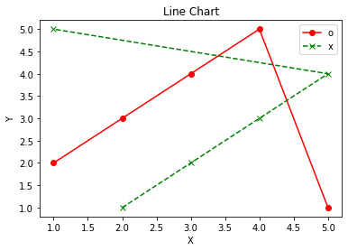
It is almost the same as drawing a scatter diagram, the difference is that the line style is added to the parameter marker. In the example, we used straight lines (-) and dashed lines (-). There are four types of lines, you can refer to the official website .
Seaborn
Seaborn uses different functions to draw scatter and line charts. Compared with Matplotlib, Seaborn can simply draw more beautiful charts. Of course, Matplotlib can also draw the same beautiful charts, but you have to do more things.
Scatter Charts
scatterplot() can draw scatter charts. Its declaration is as follows. We only list the commonly used parameters here. Please refer to the official website for other parameters.
seaborn.scatterplot(*,
                    x=None,
                    y=None,
                    hue=None,
                    style=None,
                    size=None,
                    data=None,
                    palette=None,
                    sizes=None,
alpha=None)- x: The coordinates on the x-axis. The type is array-like or column name of data.
- y: The coordinates on the y-axis. The type is array-like or column name of data.
- data: Data.
- hue: Grouping for color. The type is array-like or column name of data.
- style: Grouping for style. The type is array-like or column name of data.
- size: Grouping for size. The type is array-like or column name of data.
- sizes: Size. The type is list, dict, or tuple.
- alpha: Opacity.
- palette:Color map。
The example is as follows.
import pandas as pd
import seaborn as sns

df = pd.DataFrame([
    ['Asia', 'T', 120, 150],
    ['Asia', 'J', 150, 100],
    ['Europe', 'E', 150, 200],
    ['Europe', 'F', 200, 150],
    ['Americas', 'U', 250, 150],
    ['Americas', 'M', 70, 100],
], columns=['continent', 'country', 'gdp', 'life'])

ax = sns.scatterplot(x=df['gdp'], y=df['life'], hue=df['continent'])
ax.set_title('Scatter Chart')
ax = sns.scatterplot(x='gdp', y='life', data=df,
                     hue='continent', style='continent', palette='Set2',
                     size='continent', sizes=(20, 100))
ax.set_title('Scatter Chart')
We can see that scatterplot() uses the column name as the title of the x-axis and y-axis by default. The parameter hue can help us classify and choose different colors, which is quite convenient. In addition, we only need to pass column names to the parameters style and size, and they will help us to classify and select different styles and sizes according to the data.
However, the parameter sizes is the interval of the specified size. When classified according to the parameter size, the size will be selected corresponding to the interval of sizes.
The parameter palette is to set the color map. In the example, we set to use the built-in Set2 palette.
set_title() It is to set the title of the entire chart.
Line Charts
lineplot() can draw a line graph. Its declaration is as follows. We only list the commonly used parameters here. Please refer to the official website for other parameters.
seaborn.lineplot(*,
                 x=None,
                 y=None,
                 hue=None,
                 size=None,
                 style=None,
                 data=None,
                 palette=None,
sizes=None)- x: The coordinates on the x-axis. The type is array-like or column name of data.
- y: The coordinates on the y-axis. The type is array-like or column name of data.
- data: Data.
- hue: Grouping for color. The type is array-like or column name of data.
- style: Grouping for style. The type is array-like or column name of data.
- size: Grouping for size. The type is array-like or column name of data.
- sizes: Size. The type is list, dict, or tuple.
- palette:Color map。
The parameters of lineplot() are very similar to those of scatterplot(). Several commonly used parameters are almost identical. Let’s take a look at an example.
import pandas as pd
import seaborn as sns

df = pd.DataFrame([
    ['T', 2019, 150],
    ['T', 2020, 200],
    ['E', 2019, 170],
    ['E', 2020, 160],
    ['U', 2019, 200],
    ['U', 2020, 180],
], columns=['country', 'year', 'life'])

ax = sns.lineplot(x='year', y='life', data=df.query('country=="T"'))
ax.set_title('Line Chart')
ax = sns.lineplot(x='year', y='life', data=df,
                  hue='country', style='country', palette='Set2',
                  size='country', sizes=(2, 10))
ax.set_title('Line Chart')
We can see that the example of lineplot() is almost the same as the example of scatterplot(). Compared with Matplotlib, lineplot() automatically helps us choose the line style. These automated functions allow us to focus more on the business logic of the program.
Plotly Express
Plotly Express also provides different functions to draw scatter and line charts. Its usage is as concise as Seaborn.
Scatter Charts
scatter() can draw scatter charts. Its declaration is as follows. It has a lot of parameters, but we only list the commonly used parameters here. Please refer to the official website for the rest of the parameters.
plotly.express.scatter(data_frame=None,
                       x=None,
                       y=None,
                       color=None,
                       symbol=None,
                       size=None,
                       hover_name=None,
                       opacity=None,
                       size_max=None,
title=None)- data_frame: Data.
- x: The coordinates on the x-axis. The type is array-like or column name of data.
- y: The coordinates on the y-axis. The type is array-like or column name of data.
- title: The title of the chart.
- color: Grouping for color. The type is array-like or column name of data.
- symbol: Grouping for style. The type is array-like or column name of data.
- size: Grouping for size. The type is array-like or column name of data.
- size_max: The maximum size.
- opacity: Opacity.
- hover_name: When the cursor is moved to a point, the detailed data of the point will be displayed. hover_name can set the title of this detail box.
The example is as follows.
import pandas as pd
import plotly.express as px

df = pd.DataFrame([
    ['Asia', 'T', 120, 150],
    ['Asia', 'J', 150, 100],
    ['Europe', 'E', 150, 200],
    ['Europe', 'F', 200, 150],
    ['Americas', 'U', 250, 150],
    ['Americas', 'M', 70, 100],
], columns=['continent', 'country', 'gdp', 'life'])

px.scatter(df, x='gdp', y='life', title='Scatter Chart')px.scatter(df, x='gdp', y='life',
color='continent', title='Scatter Chart',
hover_name='country', symbol='country',
size='life', size_max=20)
We can see the output chart in nbviewer.
It is very similar to the way of using Seaborn. For most of the parameters, we only need to pass in the name of columns, and then it will group the data and select colors, styles, and sizes.
Line Charts
line() can draw a scatter charts. Its declaration is as follows. We only list the commonly used parameters here. Please refer to the official website for other parameters.
plotly.express.line(data_frame=None,
                    x=None,
                    y=None,
                    color=None,
                    line_dash=None,
title=None)- data_frame: Data.
- x: The coordinates on the x-axis. The type is array-like or column name of data.
- y: The coordinates on the y-axis. The type is array-like or column name of data.
- title: The title of the chart.
- color: Grouping for color. The type is array-like or column name of data.
- line_dash: Grouping for style. The type is array-like or column name of data.
The example is as follows.
import pandas as pd
import plotly.express as px

df = pd.DataFrame([
    ['T', 2019, 150],
    ['T', 2020, 200],
    ['E', 2019, 170],
    ['E', 2020, 160],
    ['U', 2019, 200],
    ['U', 2020, 180],
], columns=['country', 'year', 'life'])

px.line(df.query('country=="T"'), x='year', y='life', title='Line Chart')
px.line(df, x='year', y='life', color='country', title='Line Chart', line_dash='country')

We can see the output chart in nbviewer.
Most of the parameters are used in the same way as scatter(). The parameter line_dash will group the data and select line styles.
Conclusion
We introduced 3 packages for drawing scatter and line charts, namely Matplotlib, Seaborn, and Plotly Express. Seaborn and Plotly Express provide high-level functions to help us draw beautiful graphs quickly. In addition, Plotly Express provides additional information in an interactive way.


