
Pie/donut/sunburst charts are often used to describe the relative relationship between quantities or percentages. We will introduce how to draw a pie chart using Python’s Matplotlib and Plotly Express package.
Since Seaborn does not provide a method to draw a pie chart, we will not introduce Seaborn in this article.
The complete code can be found in .
Table of Contents
Matplotlib
Matplotlib’s pie() allows us to draw a pie chart very easily. Its declaration is as follows. Please refer to the official website for other parameters.
matplotlib.pyplot.pie(x,
                      explode=None,
                      labels=None,
                      colors=None,
                      autopct=None,
data=None)- x: 1D data.
- explode: The offset of each sector. The type is array-like.
- labels: The label of each block. The type is array-like.
- colors: The color of each block. The type is array-like.
- autopct: The format of the percentage in the block. The type is string.
- data: Data. If data is passed to the parameter data, the parameter x, explode, labels, and colors will be the column names of data.
Pie Charts
pie() is quite simple to use, let’s take a look at the following example.
import pandas as pd
import matplotlib.pyplot as plt

df = pd.DataFrame([
    ['Czech Republic', 10228744], ['France', 61083916], ['Germany', 82400996],
    ['Greece', 10706290], ['Italy', 58147733], ['Netherlands', 16570613],
    ['Poland', 38518241], ['Portugal', 10642836], ['Romania', 22276056],
    ['Spain', 40448191], ['Turkey', 71158647], ['United Kingdom', 60776238]],
    columns=['country', 'pop'])

plt.pie(df['pop'], labels=df['country'], autopct='%1.2f%%')
plt.title('Population')
plt.show()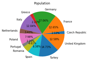
In the example, we pass the population and country name to pie(), and specify the format for displaying percentages. pie() will automatically add up all populations and calculate the percentage.
If we want to pull away a sector from the radius, we can add an offset to each sector in the parameter explode. The following example shows how to use parameter explode.
explode = [0] * len(df)
explode[9] = 0.2

plt.pie(df['pop'], labels=df['country'], autopct='%1.2f%%', explode=explode)
plt.title('Population')
plt.show()
Donut Charts
Donut charts are a variation of pie charts. In fact, it means digging out the center of the pie chart. We can use pie() to draw a donut chart, an example is as follows.
fig, ax = plt.subplots()
size = 0.4
ax.pie(df['pop'], labels=df['country'],
       radius=1-size, wedgeprops=dict(width=size, edgecolor='w'))
plt.title('Population')
plt.show()
We use the parameters radius and wedgeprops of pie() to draw a donut chart. The parameter radius refers to the radius of the pie chart. However, the parameter wedgeprops is the parameter for setting each sector. The width parameter is used to set the radius of sectors. For other parameters of sectors, please refer to Wedge .
So, in the example, we set the radius of the pie chart to 0.6 (1-0.4), and the radius of sectors are set to 0.4. The sum of the two is 1. If we do not set the parameter radius, the radius of the center blank will be 1, which will be much larger than the current one.
Sunburst Charts
Sunburst charts are also a variation of pie charts. The following example shows how to use pie() to draw a sunburst charts.
df = pd.DataFrame([
    ['France', 61083916, 'Europe'], ['Germany', 82400996, 'Europe'], ['Italy', 58147733, 'Europe'],
    ['Spain', 40448191, 'Europe'], ['United Kingdom', 60776238, 'Europe'], ['Taiwan', 23174294, 'Asia'],
    ['Japan', 127467972, 'Asia'], ['Korean', 49044790, 'Asia'], ['China', 1318683096, 'Asia']],
    columns=['country', 'pop', 'continent'])
europe_sum = df[df['continent']=='Europe']['pop'].sum()
asia_sum = df[df['continent']=='Asia']['pop'].sum()

fig, ax = plt.subplots()

size = 0.4

ax.pie(df['pop'], labels=df['country'],
       autopct='%1.2f%%', pctdistance=0.8,
       radius=1, wedgeprops=dict(width=size, edgecolor='w'))

ax.pie([europe_sum, asia_sum], labels=['Europe', 'Asia'], labeldistance=0.2,
       autopct='%1.2f%%', pctdistance=0.6,
       radius=1-size, wedgeprops=dict(width=size, edgecolor='w'))

plt.title('Population')
plt.show()
This example uses two donut charts to combine into a sunburst chart. When combining, the outer donut chart will overlap the inner donut chart’s labels, so we have to manually move the labels to a better place. The parameter labeldistance is used to adjust the offset of the labels; and the parameter pctdistance is the offset of the percentage.
Plotly Express
Plotly Express’s pie() can be used to draw a pie chart. Let’s take a look at its declaration first. Please refer to the official website for other parameters.
plotly.express.pie(data_frame=None,
                   names=None,
                   values=None,
                   title=None,
hole=None)- data_frame: Data. The type is DataFrame, array-like, or dict.
- names: The label of each sector. The type is data_frame column name, or array-like.
- values: The value of each sector. The type is data_frame column name, or array-like.
- title: The title of the chart.
- hole: The radius of the center blank area.
Pie Charts
Similar to Matplotlib’s pie(), Plotly Express’s pie() is quite simple to use. The example is as follows.
import pandas as pd
import plotly.express as px
df = pd.DataFrame([
['Czech Republic', 10228744], ['France', 61083916], ['Germany', 82400996],
['Greece', 10706290], ['Italy', 58147733], ['Netherlands', 16570613],
['Poland', 38518241], ['Portugal', 10642836], ['Romania', 22276056],
['Spain', 40448191], ['Turkey', 71158647], ['United Kingdom', 60776238]],
columns=['country', 'pop'])
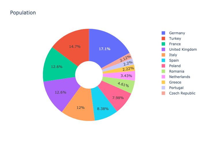
fig = px.pie(df, values='pop', names='country', title='Population')
fig.show()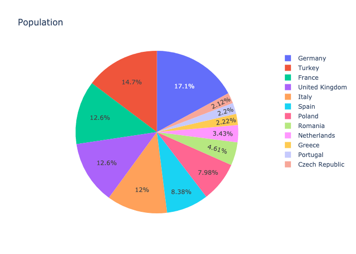
The pie chart drawn by Plotly Express is quite nice, and it also automatically adds a category bar for us. In addition, we noticed that when the color is darker, it will automatically change the color of the labels to white. Compared with Matplotlib, its percentage position is better.
The next example shows how to display labels in each sector.
fig = px.pie(df, values='pop', names='country', title='Population')
fig.update_traces(textposition='inside', textinfo='percent+label', insidetextorientation='radial')
fig.show()
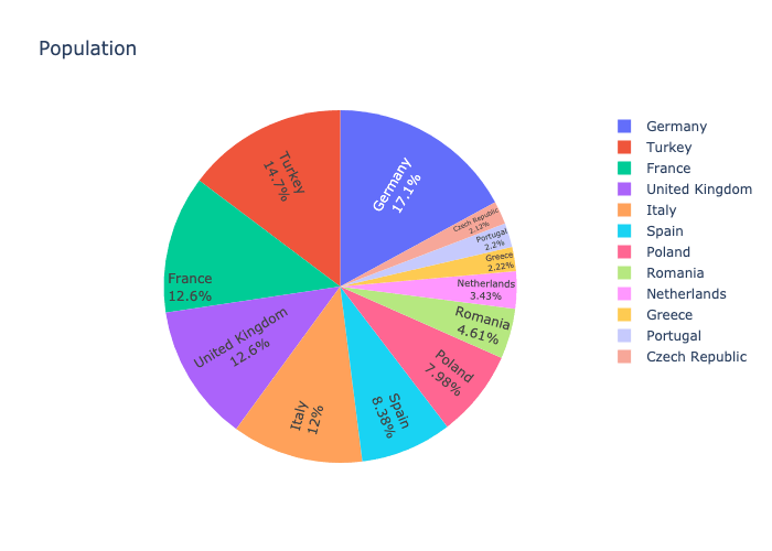
The example uses update_traces() to set the format of the labels in sectors. The parameter textposition is set to display labels in sectors. The parameter textinfo sets the format as label plus percentage. The parameter insidetextorientation is to set the direction of the labels. These parameters can refer to Pie. In addition, we also noticed that when sectors are very small, it will automatically adjust the size of the labels, which is quite user-friendly.
The following example shows how to pull a sector away from the radius.
import plotly.graph_objects as go

pull = [0] * len(df)
pull[9] = 0.2

fig = go.Figure(data=[go.Pie(labels=df['country'], values=df['pop'], pull=pull)])
fig.show()
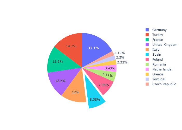
Although the code is not too complicated, compared with Matplotlib, it is indeed a bit more complicated to pull a sector away from the radius. We first need to create a Pie graphic object, because Pie() has more parameters available. We use the parameter pull to set the offset of each sector.
The official article provides many examples of drawing pie charts.
Donut Charts
Next, let’s see how Plotly Express draws a donut chart.
fig = px.pie(df, values='pop', names='country', title='Population', hole=.3)
fig.show()
Compared with Matplotlib, this is very simple. We only need to set the size of the parameter hole!
Sunburst Charts
Plotly Express’s sunburst is used to draw a sunburst chart. Its declaration is as follows. Please refer to the official website for other parameters.
plotly.express.sunburst(data_frame=None,
                        names=None,
                        values=None,
                        parents=None,
title=None,)- data_frame: Data. The type is DataFrame, array-like, or dict.
- names: The label of each sector. The type is data_frame column name, or array-like.
- values: The value of each sector. The type is data_frame column name, or array-like.
- parents: The parent of each sector. The type is data_frame column name, or array-like.
- title: The title of the chart.
Roughly similar to pie(), let us first look at an example.
df = pd.DataFrame([
    ['Europe', 586098529, 'Total'], ['Asia', 3811953827, 'Total'],
    ['France', 61083916, 'Europe'], ['Germany', 82400996, 'Europe'], ['Italy', 58147733, 'Europe'],
    ['Spain', 40448191, 'Europe'], ['United Kingdom', 60776238, 'Europe'], ['Taiwan', 23174294, 'Asia'],
    ['Japan', 127467972, 'Asia'], ['Korean', 49044790, 'Asia'], ['China', 1318683096, 'Asia']],
    columns=['country', 'pop', 'continent'])
fig = px.sunburst(df, names='country', values='pop', parents='continent', title='Population')
fig.show()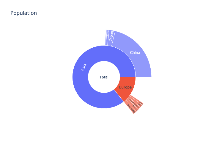
The parameter parent is to specify the parent of each sector, and it ends up like a tree structure.
Compared with Matplotlib, Plotly Express’s sunburst() is quite simple. Moreover, it can also draw outer donut chart with only partial sectors.
The official article provides many examples of drawing sunburst charts.
Conclusion
We introduced two packages for drawing pie charts. If you just want to draw a general pie chart, Matplotlib is sufficient and quite simple. However, if you want an interactive toolbar, or want to produce more beautiful charts, Plotly Express can do it easily.


