
A bar chart is a chart commonly used in statistics. There are many packages for Python that can easily plot data into bar charts. We will introduce Matplotlib , Seaborn, and Plotly Express respectively.
The complete code can be found in .
Table of Contents
Matplotlib
Matplotlib‘s bar() can draw vertical bar charts, and barh() can draw horizontal bar charts. Their declaration is as follows. However, we only introduce a few of the most important and commonly used parameters here. For the remaining parameters, please refer to the official website.
matplotlib.pyplot.bar(x, height, width=0.8)
- x: The coordinates on the x-axis. Type is float or array-like.
- height: The height of each bar, which can also be thought of as the coordinate of the y-axis. Type is float or array-like.
- width: The width of each bar. Type is float or array-like.
matplotlib.pyplot.barh(y, width, height=0.8)
- y: The coordinates on the y-axis. Type is float or array-like.
- width: The length of each bar, which can also be thought of as the coordinates of the x-axis. Type is float or array-like.
- height: The width of each bar. Type is float or array-like.
Bar Charts
The following example shows how to use bar() to draw a bar charts.
import numpy as np
import matplotlib.pyplot as plt

students = ['Jack', 'Mary', 'Mike', 'David']
math_scores = [78, 67, 90, 81]
x = np.arange(len(students))
plt.bar(x, math_scores, color=['red', 'green', 'blue', 'yellow'])
plt.xticks(x, students)
plt.xlabel('Students')
plt.ylabel('Math')
plt.title('Final Term')
plt.show()
The following example shows how to use barh() to draw a bar charts.
from matplotlib import cm

cmap = cm.jet(np.linspace(0, 1, len(students)))
plt.barh(x, math_scores, color=cmap)
plt.yticks(x, students)
plt.ylabel('Students')
plt.xlabel('Math')
plt.title('Final Term')
plt.show()
len(students) is 4, and np.arange(4) returns [0, 1, 2, 3]. So x is the coordinates of x-axis. The parameter color can specify the color of each bar.
After that, we call xticks() to set tick labels of x-axis.
xlabel() and ylabel() are to set the titles of x-axis and y-axis. And, title() can set the title of chart.
Finally, we call show() to display the chart. In a notebook, there is no need to call show().
In addition, if there are many bars in the chart, setting colors for each bar is very troublesome. At this time, we can use Matplotlib.cm to generate an array of colors. cm is the abbreviation of color map. np.linspace(0, 1, 4) means to divide [0, 1] into 4 parts. Therefore, it returns [0., 0.33, 0.67, 1.], and jet() will return an array of colors from the jet color map according to the array intervals.
Grouped Bar Charts
bar() and barh() can also draw grouped bar charts, the example is as follows.
import numpy as np
import matplotlib.pyplot as plt

students = ['Jack', 'Mary', 'Mike', 'David']
math_scores = [78, 67, 90, 81]
history_scores = [94, 71, 65, 88]
x = np.arange(len(students))
width = 0.3
plt.bar(x, math_scores, width, color='green', label='Math')
plt.bar(x + width, history_scores, width, color='blue', label='History')
plt.xticks(x + width / 2, students)
plt.ylabel('Math')
plt.title('Final Term')
plt.legend(bbox_to_anchor=(1,1), loc='upper left')
plt.show()
Like drawing bar charts, but we need to call bar() twice to draw math_scores and history_scores. The first parameter of bar() is x-axis coordinates, so when drawing history_scores, we need to specify the coordinates x + width. As the result, history_scores will be drawn next to math_scores. Then, we also need to adjust the locations of the tick names on the x-axis so that it can be in the middle of the two bars.
Finally, we call legend() to display a legend on the upper right side.
Stacked Bar Charts
bar() and barh() can also draw stacked bar charts, the example is as follows.
import numpy as np
import matplotlib.pyplot as plt

students = ['Jack', 'Mary', 'Mike', 'David']
math_scores = [78, 67, 90, 81]
history_scores = [94, 71, 65, 88]
x = np.arange(len(students))

plt.bar(x, math_scores, color='blue', label='Math')
plt.bar(x, history_scores, color='green', label='History', bottom=math_scores)
plt.xticks(x, students)
plt.xlabel('Students')
plt.ylabel('Math')
plt.title('Final Term')
plt.legend(bbox_to_anchor=(1,1), loc='upper left')
plt.show()
Similar to grouped bar charts, we call bar () twice to draw math_scores and history_scores. When drawing history_scores, its x coordinates are the same as math_scores, so pass x to the first parameter. But, here we need to use bottom parameter. bottom refers to which coordinate on the y-axis to start drawing from, so we pass in math_scores. In this way, history_scores will be drawn after math_scores. If you use barh(), you should use left parameter instead.
Error Bar Charts
Error bar charts are bar charts with errors, the example is as follows.
import numpy as np
import pandas as pd
import matplotlib.pyplot as plt

df = pd.DataFrame([
    ['Jack', 78, 94],
    ['Mary', 67, 71],
    ['Mike', 90, 65],
    ['David', 81, 88],
], columns=['Students', 'Math', 'History'])

df_avg = (df['Math'] + df['History']) / 2
df_max = df[['Math', 'History']].max(axis=1)
df_min = df[['Math', 'History']].min(axis=1)
lower_errors = df_avg - df_min
upper_errors = df_max - df_avg

x = np.arange(len(df))

plt.bar(x, df_avg, color=['red', 'green', 'blue', 'yellow'], yerr=[lower_errors, upper_errors], capsize=5)
plt.xticks(x, df['Students'])
plt.xlabel('Students')
plt.ylabel('Math')
plt.title('Final Term')
plt.show()
First, we calculate the average of Math and History. After that, calculate the upper and lower error values. Then, pass lower_errors and upper_errors to yerr parameter. And, the parameter capsize is to set the width of the error bars. If you use barh(), you should use xerr parameter instead.
Seaborn
Seaborn is also a charting kit. It is based on Matplotlib, but provides high-level APIs, so it is easier to use than Matplotlib. In addition, I think the chars are much more beautiful than Matplotlib.
Seaborn’s barplot() can draw bar charts, and its declaration is as follows. We only list the commonly used parameters. Please refer to the official website for the remaining parameters.
seaborn.barplot(x=None, y=None, hue=None, data=None)
- x: Data drawn on the x-axis. It can be a column name in the data, or an array.
- y: Data plotted on the y axis. It can be a column name in the data, or an array.
- hue: Group. It can be a column name in the data, or an array.
- data: Data. The type is DataFrame or array.
Bar Charts
The following is an example of barplot().
import pandas as pd
import seaborn as sns

df = pd.DataFrame([
    ['Jack', 78],
    ['Mary', 67],
    ['Mike', 90],
    ['David', 81],
], columns=['Students', 'Math'])

ax = sns.barplot(x='Students', y='Math', data=df)
ax.set_title('Final Term')
ax = sns.barplot(x='Math', y='Students', data=df)
ax.set_title('Final Term')
Compared with bar(), the code of barplot() is quite short. Moreover, you can see that in the example, we only need to specify the name of the column, without directly operating the data, which is quite convenient. In addition, barplot() will directly determine whether to draw a vertical or horizontal bar chart based on the data type of the parameters x and y. barplot() will also directly use the column names as the titles on the x-axis and y-axis.
If you want to set the title of the chart, you can call set_title().
Grouped Bar Charts
barplot() is also quite easy to draw grouped bar charts. The example is as follows.
import pandas as pd
import seaborn as sns

df = pd.DataFrame([
    ['Jack', 'Math', 78],
    ['Jack', 'History', 94],
    ['Mary', 'Math', 67],
    ['Mary', 'History', 71],
    ['Mike', 'Math', 90],
    ['Mike', 'History', 65],
    ['David', 'Math', 81],
    ['David', 'History', 88],
], columns=['Students', 'Class', 'Scores'])

ax = sns.barplot(x='Students', y='Scores', hue='Class', data=df)
ax.set_title('Final Term')
We only need to set to the parameter hue with the column name used to group. The categorical levels will be displayed automatically.
Error Bar Charts
barplot() draws error bars by default. The example is as follows.
import pandas as pd
import seaborn as sns

df = pd.DataFrame([
    ['Jack', 'Math', 78],
    ['Jack', 'History', 94],
    ['Mary', 'Math', 67],
    ['Mary', 'History', 71],
    ['Mike', 'Math', 90],
    ['Mike', 'History', 65],
    ['David', 'Math', 81],
    ['David', 'History', 88],
], columns=['Students', 'Class', 'Scores'])

sns.barplot(x='Students', y='Scores', data=df)
In the example, Jack has two scores, and barplot() will automatically calculate the average for you and draw error bars.
Plotly Express
Plotly Express is also a chart drawing suite and is as easy as Seaborn is. Not only that, it also provides a tool bar that allows you to scale or move charts.
The bar() of Plotly Express can draw a bar chart, and its declaration is as follows. bar() has quite a few parameters, we only list the commonly used ones. Please refer to the official website for the rest.
plotly.express.bar(data_frame=None, x=None, y=Non, title=None)
- data_frame: Data. The type is DataFrame, array-like or dict.
- x: Data drawn on the x-axis. It can be a column name in data_frame or array-like.
- y: Data plotted on the y axis. It can be a column name in data_frame or array-like.
- title: The title of the chart. The type is str.
Bar Charts
The following is an example of bar().
import plotly.express as px
import pandas as pd

df = pd.DataFrame([
    ['Jack', 78],
    ['Mary', 67],
    ['Mike', 90],
    ['David', 81],
], columns=['Students', 'Math'])

px.bar(df, x='Students', y='Math', title='Final Term')
px.bar(df, x='Math', y='Students', title='Final Term')
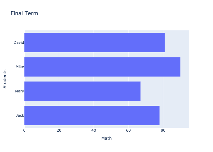
We can see the output in nbviewer .
Similar to Seaborn’s barplot(), we only need to specify the name of the column. It will also determine whether to draw a vertical or horizontal bar chart based on the type of data. It also uses the column names as the titles on the x-axis and y-axis. In addition, if you want to set the title of the chart, you only need to pass a string into the parameter title.
Grouped Bar Charts
bar() is also quite easy to draw a grouped bar chart, the example is as follows.
import pandas as pd
import plotly.express as px

df = pd.DataFrame([
    ['Jack', 'Math', 78],
    ['Jack', 'History', 94],
    ['Mary', 'Math', 67],
    ['Mary', 'History', 71],
    ['Mike', 'Math', 90],
    ['Mike', 'History', 65],
    ['David', 'Math', 81],
    ['David', 'History', 88],
], columns=['Students', 'Class', 'Scores'])

px.bar(df, x='Students', y='Scores', color='Class', barmode='group', title='Final Term')
df = pd.DataFrame([
['Jack', 78, 94],
['Mary', 67, 71],
['Mike', 90, 65],
['David', 81, 88],
], columns=['Students', 'Math', 'History'])
px.bar(df, x='Students', y=['Math', 'History'], barmode='group', title='Final Term')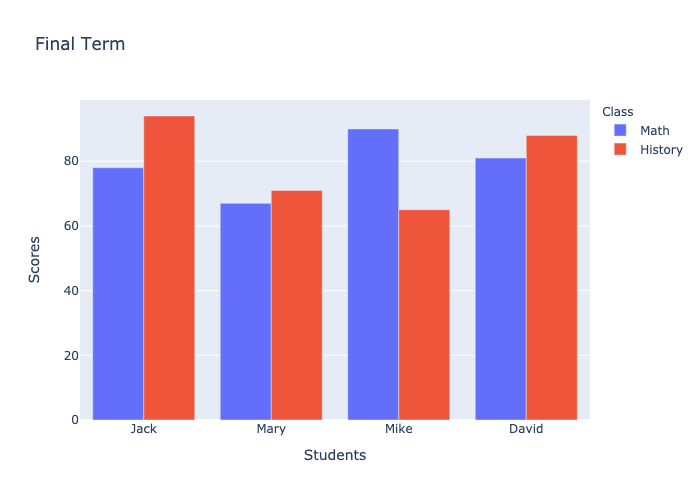
We can see the output in nbviewer .
First, the parameter barmode must be set to group. Then, set the name of the column to be grouped in the parameter color. Another method is to set the array of column names in the parameter y. You can choose a convenient method according to the structure of the data.
Stacked Bar Charts
The way to draw a stacked bar chart is the same as to draw a grouped bar chart. The only difference is that the parameter barmode is set to relative. The example is as follows.
import pandas as pd
import plotly.express as px

df = pd.DataFrame([
    ['Jack', 'Math', 78],
    ['Jack', 'History', 94],
    ['Mary', 'Math', 67],
    ['Mary', 'History', 71],
    ['Mike', 'Math', 90],
    ['Mike', 'History', 65],
    ['David', 'Math', 81],
    ['David', 'History', 88],
], columns=['Students', 'Class', 'Scores'])

px.bar(df, x='Students', y='Scores', color='Class', title='Final Term'
df = pd.DataFrame([
    ['Jack', 78, 94],
    ['Mary', 67, 71],
    ['Mike', 90, 65],
    ['David', 81, 88],
], columns=['Students', 'Math', 'History'])

px.bar(df, x='Students', y=['Math', 'History'], title='Final Term')
We can see the output in nbviewer .
The default value of the parameter barmode is relative, so just don’t set it.
Error Bar Charts
The way bar() draws error bars is very similar to Matplotlib. We have to calculate the error values ourselves, the example is as follows.
import pandas as pd
import plotly.express as px

df = pd.DataFrame([
    ['Jack', 78, 94],
    ['Mary', 67, 71],
    ['Mike', 90, 65],
    ['David', 81, 88],
], columns=['Students', 'Math', 'History'])

df_avg = (df['Math'] + df['History']) / 2
df_max = df[['Math', 'History']].max(axis=1)
df_min = df[['Math', 'History']].min(axis=1)

px.bar(df,
       x='Students',
       y=df_avg,
       error_y=df_max-df_avg,
       error_y_minus=df_avg-df_min,
       title='Final Term')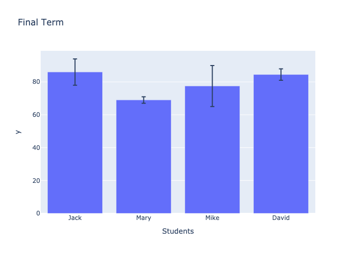
We can see the output chart in nbviewer .
Conclusion
We introduced three packages for drawing bar charts, namely Matplotlib, Seaborn, and Plotly Express. The usage of Seaborn and Plotly Express is very similar and both are quite simple. Which package do you prefer to draw charts?


