Heatmaps are often used to display the correlation coefficient of data. In this article, we will introduce how to use Python’s Matplotlib, Seaborn, and Plotly Express packages to draw heatmaps.
The complete code can be found in .
Table of Contents
Matplotlib
Matplotlib does not have a specific function for drawing heatmaps, but we can use its imshow() to draw heatmaps. imshow() can draw data into 2D regular raster. Raster graphics and heatmaps have a grid in common, so we can use it to draw a heatmap. Here’s its declaration. For detailed parameters, please refer to the official website .
matplotlib.pyplot.imshow(X, cmap=None)
- X: 2D data structure.
- cmap: Color map.
The following example shows how to use imshow() to draw a heatmap.
import numpy as np
import pandas as pd
import matplotlib.pyplot as plt

attributes = ['Women Entrepreneurship Index', 'Entrepreneurship Index', 'Inflation rete', 'Female Labor Force Participation Rate']
df = pd.DataFrame([
    [1.0, 0.91, -0.46, 0.44],
    [0.91, 1, -0.4, 0.33],
    [-0.46, -0.4, 1, -0.14],
    [0.44, 0.33, -0.14, 1],
], columns=attributes, index=attributes)

fig, ax = plt.subplots()
im = ax.imshow(df)

ax.set_xticks(np.arange(len(df.columns)))
ax.set_xticklabels(df.columns)
plt.setp(ax.get_xticklabels(), rotation=45, ha="right", rotation_mode="anchor")

ax.set_yticks(np.arange(len(df.index)))
ax.set_yticklabels(df.index)

for i in range(len(df.columns)):
    for j in range(len(df.index)):
        text = ax.text(j, i, df.iloc[i, j], ha="center", va="center", color="w")

ax.set_title("Corr")
plt.show()
The example code is quite long. Mainly because imshow() is not originally designated to draw heatmaps. Therefore, we first use imshow() to draw a raster graph, and then additionally add the title of the ticks on the x-axis and y-axis, and then add data to each cell. It will end up like a heat map.
First, we first use subplots() to create a figure and a subplot. The return value of fig is the figure, and ax is the subplot. Then, call ax.imshow(df) to draw df as a raster graph on the subplot.
Next, call set_xticks() to set the number of ticks on the x-axis , and then call set_xticklabels() to set the title on the x-axis ticks. Also call set_yticks() and set_yticklabels() for the y-axis. Call setp() to rotate the title on the x-axis by 45 degrees.
Next is to set the corresponding data to each cell. Call text() to set data for each cell. Finally, call set_title() to set the title of the chart, and call show() to display the chart.
There are more examples on the official website to show how to draw heatmaps, including how to add a color bar and set the gap width between cells.
Seaborn
Seaborn’s heatmap() is designated to draw heatmaps. The following is its declaration. Please refer to the official website for other parameters.
seaborn.heatmap(data, cmap=None, cbar=True, annot=None)
- data: 2D data.
- cmap: Color map.
- cbar: Whether to display the colorbar.
- annot: Whether to display the corresponding data in each cell.
The following are examples of usage.
import pandas as pd
import seaborn as sns

attributes = ['Women Entrepreneurship Index', 'Entrepreneurship Index', 'Inflation rete', 'Female Labor Force Participation Rate']
df = pd.DataFrame([
    [1.0, 0.91, -0.46, 0.44],
    [0.91, 1, -0.4, 0.33],
    [-0.46, -0.4, 1, -0.14],
    [0.44, 0.33, -0.14, 1],
], columns=attributes, index=attributes)

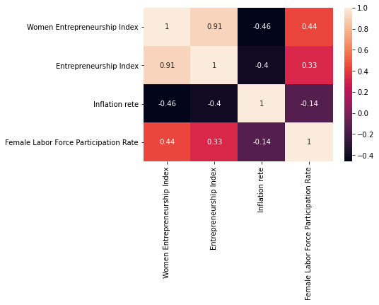
sns.heatmap(df, annot=True)
Seaborn will use the column name of the DataFrame as the title on the x-axis and y-axis. This is very convenient, so the sample code can be very simple!
Plotly Express
Similar to Matplotlib.imshow(), Plotly Express’s imshow() is used to draw 2D regular raster. However, Plotly Express is easier to use. The following is its declaration. Please refer to the official website for other detailed parameters .
plotly.express.imshow(img, labels={}, title=None)- img: 2D data.
- labels: The title of the x-axis and y-axis.
- title: The title of the chart.
The following example shows how to use imshow() to draw a heatmap.
import pandas as pd
import plotly.express as px

attributes = ['Women Entrepreneurship Index', 'Entrepreneurship Index', 'Inflation rete', 'Female Labor Force Participation Rate']
df = pd.DataFrame([
    [1.0, 0.91, -0.46, 0.44],
    [0.91, 1, -0.4, 0.33],
    [-0.46, -0.4, 1, -0.14],
    [0.44, 0.33, -0.14, 1],
], columns=attributes, index=attributes)

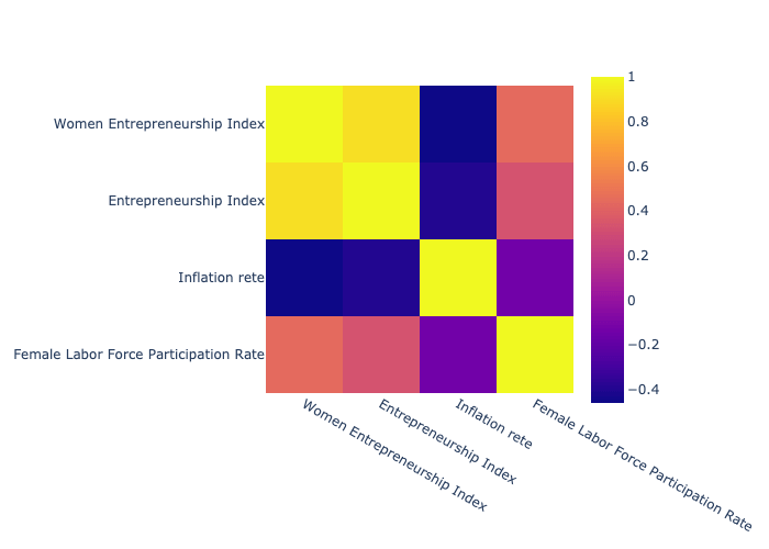
px.imshow(df)
We found that the raster graph drawn by imshow() is simply the heat map we need. However, it does not display data in each cell by default, but when you move the cursor to each cell, it will still display related data.
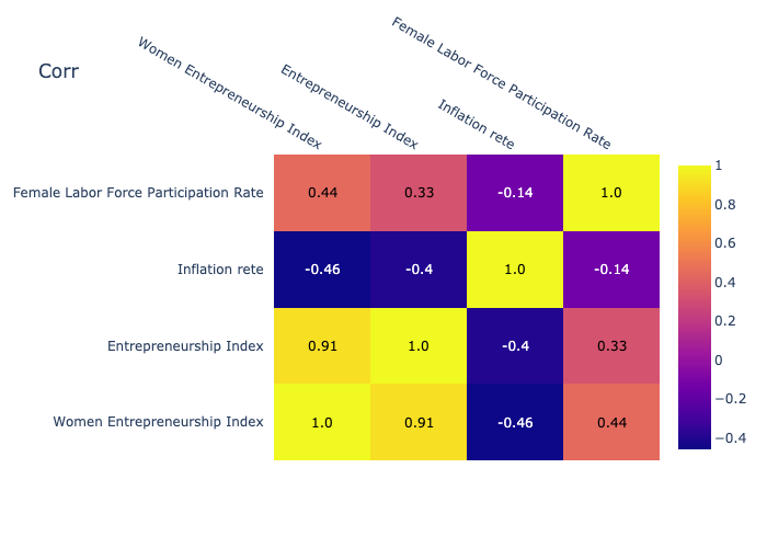
The following example shows how to display the data by default.
import plotly.figure_factory as ff

fig = ff.create_annotated_heatmap(df.values.tolist(),
                                  x=df.columns.values.tolist(),
                                  y=df.index.values.tolist())
fig.update_layout(title_text='Corr')
fig['data'][0]['showscale'] = True
fig.show()
We need to use create_annotated_heatmap() to draw heatmaps instead . We notice that we need to use parameters x and y to set the titles on x-axis and y-axis. Then, call update_layout() to set the title of the chart. Finally, fig['data'][0]['showscale'] = True is used to display the colorbar.
Conclusion
We introduced 3 packages to draw heat maps, namely Matplotlib, Seaborn, and Plotly Express. We can see that Seaborn is the easiest to use. However, if you want an interactive toolbar, you have to use Plotly Express instead.


