Choropleth Map displays spatial variations of quantities of data on a map. In this article, we will introduce how to use Python’s Plotly Express package to plot a choropleth map.
The complete code can be found in .
Table of Contents
Plotly Express
Plotly Express’s choropleth() allows us to easily plot choropleth maps. The following is its declaration. For other parameters, please refer to the official website.
plotly.express.choropleth(data_frame=None,
                          locations=None,
                          locationmode=None,
                          color=None,
                          color_discrete_map=None,
                          color_continuous_scale=None,
                          projection=None,
                          scope=None,
title=None)- data_frame: Data.
- locationmode: The value can be ‘ISO-3’, ‘USA-states’, or ‘country names’.
- locations: This data will be interpreted according to the format specified by the parameter locationmode. The value is a column name in data_frame.
- color: This data will be used to assign colors. The value is a column name in data_frame.
- scope: The area of the map. It can be ‘world’, ‘usa’, ‘europe’, ‘asia’, ‘africa’, ‘north america’, or ‘south america’. The default is ‘world’.
- projection: The map projection. Please refer to the official website for its settable values.
- title: The title of the chart.
- color_continuous_scale: The color map used for the colors on the map.
- color_discrete_map: The color map used for the colors on the map.
- color_discrete_sequence: The color map used for the colors on the map.
Example Dataset
In the examples of this article, we will use two datasets of Plotly Express. Let’s take a look at how to load these datasets and their data structures.
The first dataset is the GDP of countries in the world in 2014.
import pandas as pd

df_gdp = pd.read_csv('https://raw.githubusercontent.com/plotly/datasets/master/2014_world_gdp_with_codes.csv')
df_gdp.head()| COUNTRY | GDP (BILLIONS) | CODE |
|---|---|---|
| Afghanistan | 21.71 | AFG |
| Albania | 13.40 | WHITE |
| Algeria | 227.80 | DZA |
| American Samoa | 0.75 | ASM |
| Andorra | 4.80 | AND |
Another dataset is the population of each U.S. state in 2014.
df_us_state = pd.read_csv('https://raw.githubusercontent.com/plotly/datasets/master/2014_usa_states.csv')
df_us_state.head()| Rank | State | Postal | Population |
|---|---|---|---|
| 1 | Alabama | AL | 4849377.0 |
| 2 | Alaska | IF | 736732.0 |
| 3 | Arizona | THE | 6731484.0 |
| 4 | Arkansas | WITH | 2966369.0 |
| 5 | California | THAT | 38802500.0 |
example
The following example shows how to use choropleth().
import plotly.express as px

px.choropleth(df_gdp,
              locations='COUNTRY',
              locationmode='country names',
              color='GDP (BILLIONS)',
              projection='kavrayskiy7',
              scope='world',
              title='World GDP')
The parameter scope specifies the world map, and the parameter projection uses kavrayskiy7 projection. The parameter locationmode is set to 'country names', which tells choropleth() that the data in the parameter locations are country names. Finally, choropleth() will fill in the color for each country based on the value in the parameter color.
Continuous Color Scales
We can pass in different color maps to choropleth() in the parameter color_continuous_scale, so that we can use different colors to plot choropleth maps. Plotly Express has several built-in continuous color scalers, we can choose the colors we like.
These built-in colors are in 3 modules.
- plotly.colors.sequential: Appropriate for most continuous data.
- plotly.colors.diverging: Appropriate for continuous data that has a midpoint.
- plotly.colors.cyclical: Appropriate for continuous data that has a cyclical structure.
- plotly.colors.named_colorscales: The name of some pre-defined continuous color scales. These names will correspond to some of the continuous color scales in the above 3.
Also, if you want to reverse the order of colors, then just add _r behind of it.
Let us look at the following example.
px.choropleth(df_gdp,
              locations='COUNTRY',
              locationmode='country names',
              color='GDP (BILLIONS)',
              projection='kavrayskiy7',
              scope='world',
              title='Choropleth Map',
              color_continuous_scale=px.colors.sequential.Rainbow)
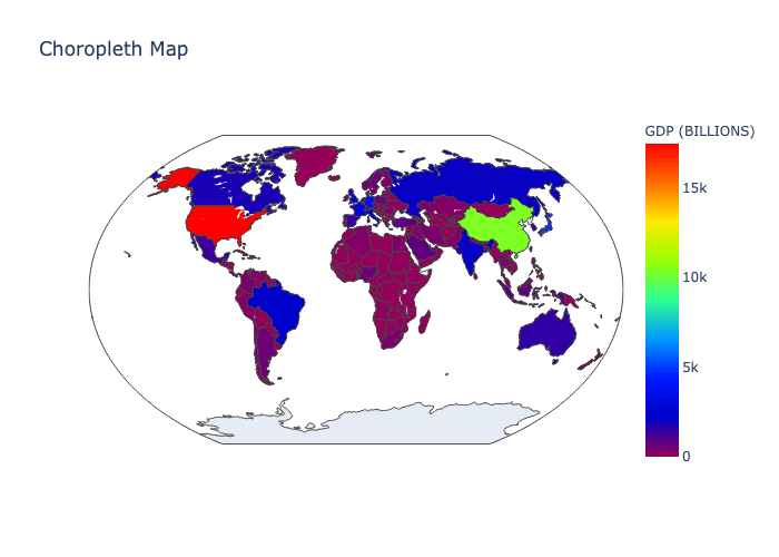
In this example, we pass px.colors.sequential.Rainbow to the parameter color_continuous_scale, then choropleth() will use Rainbow colors. If you want to reverse the order of colors, then pass px.colors.sequential.Rainbow_r instead.
The following example shows how to use named continuous color scales.
px.choropleth(df_gdp,
              locations='COUNTRY',
              locationmode='country names',
              color='GDP (BILLIONS)',
              projection='kavrayskiy7',
              scope='world',
              title='Choropleth Map',
              color_continuous_scale='jet_r')
jet is a pre-defined continuous color scale, and its reversed is jet_r. In fact, jet corresponds to px.colors.sequential.Jet.
Discrete Colors
In addition to continuous color scales, we can also use discontinuous colors to distinguish levels. Plotly Express has some pre-defined discrete colors in plotly.colors.qualitative module. These are all arrays containing a series of CSS color.
We can pass a dictionary to the parameter color_discrete_map. In this dictionary, specify the corresponding color for each value. The example is as follows.
colors = px.colors.qualitative.Set2
population_max = df_us_state['Population'].max()

def group_population(x):
    y = int(population_max / 5)
    if x < y:
        return '{}~{}'.format(0, y)
    elif x < y * 2:
        return '{}~{}'.format(y, y*2)
    elif x < y * 3:
        return '{}~{}'.format(y*2, y*3)
    elif x < y * 4:
        return '{}~{}'.format(y*3, y*4)
    else:
        return '{}~{}'.format(y*4, y*5)

df_us_state['Population (Grouped)'] = df_us_state['Population'].apply(group_population)
px.choropleth(df_us_state,
              locations='Postal',
              locationmode='USA-states',
              scope='usa',
              color='Population (Grouped)',
              color_discrete_map=dict(zip(df_us_state['Population (Grouped)'].unique(), colors)))
In this example, we will divide the data in Population fields into 5 groups, and save group labels into column Population (Grouped). Then, use zip() to map the groups and colors into an array of tuples. Finally, use dict() to convert an array of tuples into a dictionary, and then pass it to the parameter color_discrete_map.
In addition, if you don’t like to use dictionary, we can pass in an array of colors to the parameter color_discrete_sequence instead.
px.choropleth(df_us_state,
              locations='Postal',
              locationmode='USA-states',
              scope='usa',
              color='Population (Grouped)',
              color_discrete_sequence=colors)
Conclusion
When visualizing data, we may need to use choropleth maps. If you use Matplotlib Basemap to plot choropleth maps, it will really take a lot of time. Fortunately, Plotly Express provides such a convenient function so that we can easily plot choropleth maps, and the choropleth maps are plotted quite beautiful.


1 comment
Hi!
How can I export the map in a static figure?