Box Plots and Violin Plots are statistical charts that can well represent the distribution of data. In this article, we will introduce how to use Python’s Matplotlib, Seaborn, and Plotly Express packages to draw box plots and violin plots.
The complete code can be found in .
Table of Contents
Concept
Before starting to use Python to draw charts, let us first understand the structure of box and violin charts.
Box Plots
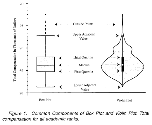
The following figure shows the structure of a box plot.

- Lower quartile (Q1, 1st quartile, or 25th percentile): The average of the lower half of the dataset.
- Median (Q2, Median, or 50th percentile): the average of the data.
- Upper quartile (Q3, 3rd quartile, or 75th percentile): the average of the upper half of the dataset.
- Interquartile range (IRQ): Q3-Q1.
- Minimum (Q0): Q1 – 1.5 * IRQ.
- Maximum (Q4): Q3 + 1.5 * IRQ.
- Whiskers: The straight line between Q0 and Q1, and Q3 and Q4.
- Outliers: The values not between Q0 and Q4.
Violin Plots
The violin chart can show the distribution of data just like the box chart. In addition, it also shows the probability density. The figure below shows their comparison.
Sample Dataset
The examples in this article all use seaborn’s tips dataset. The following example shows how to read this dataset and display its fields.
import seaborn as sns

tips = sns.load_dataset('tips')
tips.head()| total_bill | tip | sex | somker | day | time | size | |
|---|---|---|---|---|---|---|---|
| 0 | 16.99 | 1.01 | Female | No | Sun | Dinner | 2 |
| 1 | 10.34 | 1.66 | Male | No | Sun | Dinner | 3 |
| 2 | 21.01 | 3.50 | Male | No | Sun | Dinner | 3 |
| 3 | 23.68 | 3.31 | Male | No | Sun | Dinner | 2 |
| 4 | 24.59 | 3.61 | Female | No | Sun | Dinner | 4 |
Matplotlib
Box Plots
Matplotlib’s boxplot() can be used to draw box plots. The following is its declaration. Please refer to the official website for other parameters.
matplotlib.pyplot.boxplot(x, sym=None, vert=None, labels=None)
- x: Data.
- sym: The marker of outliers.
- vert: Vertical or horizontal box chart.
- labels: The labels of each dataset.
The following example shows how to use boxplot() to draw a box plot.
import matplotlib.pyplot as plt

plt.boxplot(tips[['total_bill', 'tip']], labels=['total_bill', 'tip'])
plt.title('Box Plot')
plt.xlabel('Total Bill vs Tip')
plt.ylabel('Money')
plt.show()
In this example, we can see that the use of boxplot() is quite simple. After that, call title() to set the title of the chart, and then call xlabel() and ylabel() to set the title of the x-axis and y-axis.
If you want to draw a horizontal box plot, you only need to set the parameter vert to False, as shown in the following example.
plt.boxplot(tips[['total_bill', 'tip']], vert=False, labels=['total_bill', 'tip'])
plt.title('Box Plot')
plt.xlabel('Money')
plt.ylabel('Total Bill vs Tip')
plt.show()
Violin Plots
As simple as drawing a box plot, Matplotlib also provides a dedicated function to draw a violin plot, that is, violinplot() . Its declaration is as follows. Please refer to the official website for other parameters.
matplotlib.pyplot.violinplot(dataset, vert=True)
- x: Information.
- vert: Vertical or horizontal box chart.
Compared with boxplot(), the parameters of violinplot() are relatively few. Let us first look at an example.
import matplotlib.pyplot as plt

plt.violinplot(tips[['total_bill', 'tip']])
plt.xticks([1, 2], ['total_bill', 'tip'])
plt.title('Violin Plot')
plt.xlabel('Total Bill vs Tip')
plt.ylabel('Money')
plt.show()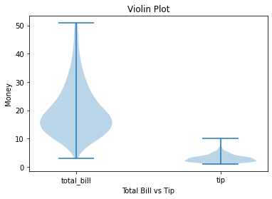
In this example, we can see that drawing a violin chart is actually very simple, but violinplot() does not provide a parameter to set labels for dataset. However, we can use xticks() to set labels.
The following example shows how to draw a horizontal violin chart.

Seaborn
Box Plots
Like Matplotlib, Seaborn’s function is also called boxplot() . Let’s take a look at its declaration. Please refer to the official website for other parameters.
seaborn.boxplot(x=None, y=None, hue=None, data=None, palette=None)
- x: Long-form data of x axis.
- y: Long-form data of y-axis.
- hue: Grouping for color..
- palette: Color map.
- data: Data.
Let’s take a look at an example.
sns.boxplot(data=tips[['total_bill', 'tip']], palette='Set2')

Seaborn is really easy to use. It automatically uses the name of the columns as the label of the dataset. In the example, we set the parameter palette to use different color maps.
The following example shows how to use parameter x and y.
sns.boxplot(data=tips, x='day', y='total_bill', palette='Set2')

In this example, we set the parameter x to day. boxplot() will use the data of day column, group the data, and it becomes 4 dataset. This can be used when you want to display the distribution of each value in a certain dataset.
The following example shows how to draw a horizontal box plot.
sns.boxplot(data=tips, x='total_bill', y='day', palette='Set2')

Seaborn will automatically determine the type of data to choose whether to draw a horizontal or vertical box plot. Of course, you can also use the parameter orient to directly specify horizontal or vertical.
The last example shows how to use the parameter hue.
sns.boxplot(data=tips, x='day', y='total_bill', hue='smoker')

The parameter hue can display a box plot with two dataset. This can be used to compare the distribution of two dataset. In addition, it will display the legend in the upper left corner.
Violin Plots
Seaborn also provides a special function to draw the violin chart, that is violinplot() . Please refer to the official website for other parameters.
seaborn.violinplot(x=None,
                   y=None,
                   hue=None,
                   data=None,
                   palette=None,
split=False)- x: Long-form data of x-axis.
- y: Long-form data of y-axis.
- hue: Grouping for color.
- palette: Color map.
- data: Data.
- Split: When grouping, draw each data set on half of the violin chart.
The parameters of Seaborn’s violinplot() are very similar to boxplot(). Let us look at the following example.
sns.violinplot(data=tips[['total_bill', 'tip']], palette='Set2')

The following is an example with parameter x and y.
sns.violinplot(data=tips, x='day', y='total_bill', palette='Set2')

Next example shows an horizontal violin plot.
sns.violinplot(data=tips, x='total_bill', y='day', palette='Set3')

The following example shows how to use the parameter hue.

Finally, let’s take a look at an example of how to use parameter split.
sns.violinplot(data=tips, x='day', y='total_bill', hue='smoker', split=True)
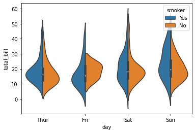
I personally thinks that Seaborn’s design of functions is quite good. Since box plots and violin plots have many similar elements, the parameters and usage of the two functions should also be the same.
Plotly Express
Box Plots
Plotly Express’s box() can be used to draw box plots. Its declaration is as follows. Please refer to the official website for other parameters.
plotly.express.box(data_frame=None,
                   x=None,
                   y=None,
                   color=None,
                   points=None,
title=None)- data_frame: Data.
- x: Long-form data of x-axis.
- y: Long-form data of y-axis.
- color: Grouping for color.
- points: Its value can be as follows:
- ‘outliers’: Only display outliers. This is the default value.
- ‘all’: Display all points.
- ‘suspectedoutliers’: display points less than 4*Q1-3*Q3 or greater than 4*Q3-3Q1.
- False: No points is displayed.
- title: Plot title.
Let’s look at an example of box().
import plotly.express as px

px.box(tips[['total_bill', 'tip']], title='Plotly Express Box Plot')

The usage of box() is quite simple and intuitive.
The next example is how to use the parameter x and y.
px.box(tips, x='day', y='total_bill', title='Plotly Express Box Plot')
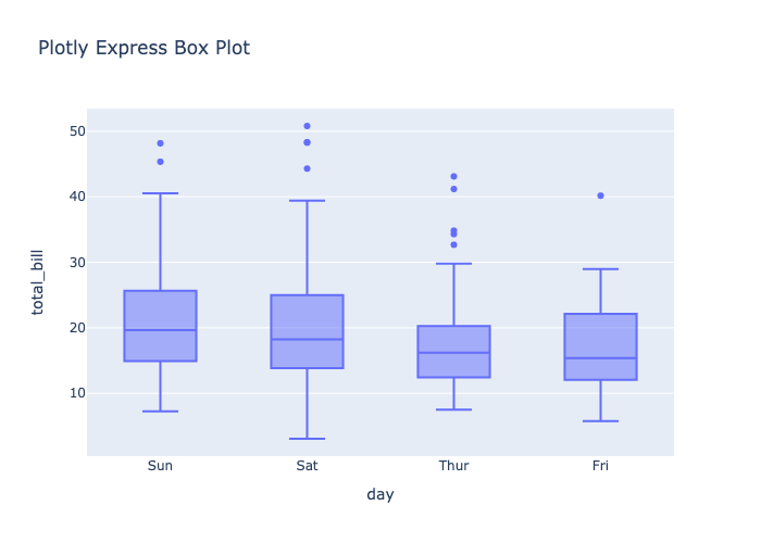
As with Seaborn when parameter x is specified to day, it will group the data of day columns to 4 datasets.
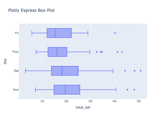
box() will determine whether to draw a horizontal or vertical box plot according to the type of data value.
px.box(tips, x='total_bill', y='day', title='Plotly Express Box Plot')
The following example shows how to use the parameter color.
px.box(tips, x='day', y='total_bill', color='smoker', title='Plotly Express Box Plot')
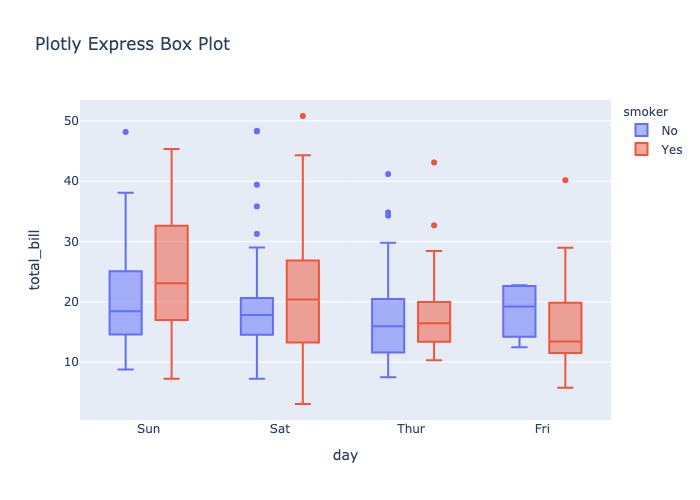
The parameter color can display two datasets and a legend on the right.
The last example shows how to use the parameter points to display the probability density of data.
px.box(tips[['total_bill', 'tip']], title='Plotly Express Box Plot', points='all')

There are more box plot examples on the official website for reference.
Violin Plots
Plotly Express provides violin() to draw violin plots. Its declaration is as follows. Please refer to the official website for other parameters.
plotly.express.violin(data_frame=None,
                      x=None,
                      y=None,
                      color=None,
                      points=None,
title=None)- data_frame: Data.
- x: Long-form data of x-axis.
- y: Long-form data of y-axis.
- color: Grouping for color.
- points: Its value can be as follows:
- ‘outliers’: Only Display outliers. This is the default value.
- ‘all’: Display all points.
- ‘suspectedoutliers’: Display points less than 4*Q1-3*Q3 or greater than 4*Q3-3Q1.
- False: No points is displayed.
- title: Plot title.
The parameters of violin() are similar to those of box(), so of course their usage is very similar. Let us look at the following example.
import plotly.express as px

px.violin(tips[['total_bill', 'tip']], title='Plotly Express Box Plot')

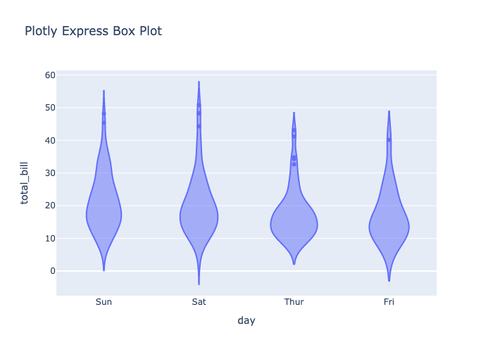
The next example show how to use parameters x and y.
px.violin(tips, x='day', y='total_bill', title='Plotly Express Box Plot')
Below is an example of a horizontal violin chart.
px.violin(tips, x='total_bill', y='day', title='Plotly Express Box Plot')

The following is an example of parameter color.
px.violin(tips, x='day', y='total_bill', color='smoker', title='Plotly Express Box Plot')

The last example shows how to use parameter points.
px.violin(tips[['total_bill', 'tip']], title='Plotly Express Box Plot', points='all')

It can be seen that the distribution and probability density of the points are actually displayed on the violin plot itself. Therefore, we don’t need to display additional points on the violin plot.
There are many examples of violin diagrams on the official website for reference.
Conclusion
We have introduced three packages for drawing box plots and violin plots in this article. Compared to Matplotlib, Seaborn and Plotly Express are easier to use, and they are very similar. In addition, Plotly Express has an interactive toolbar.


